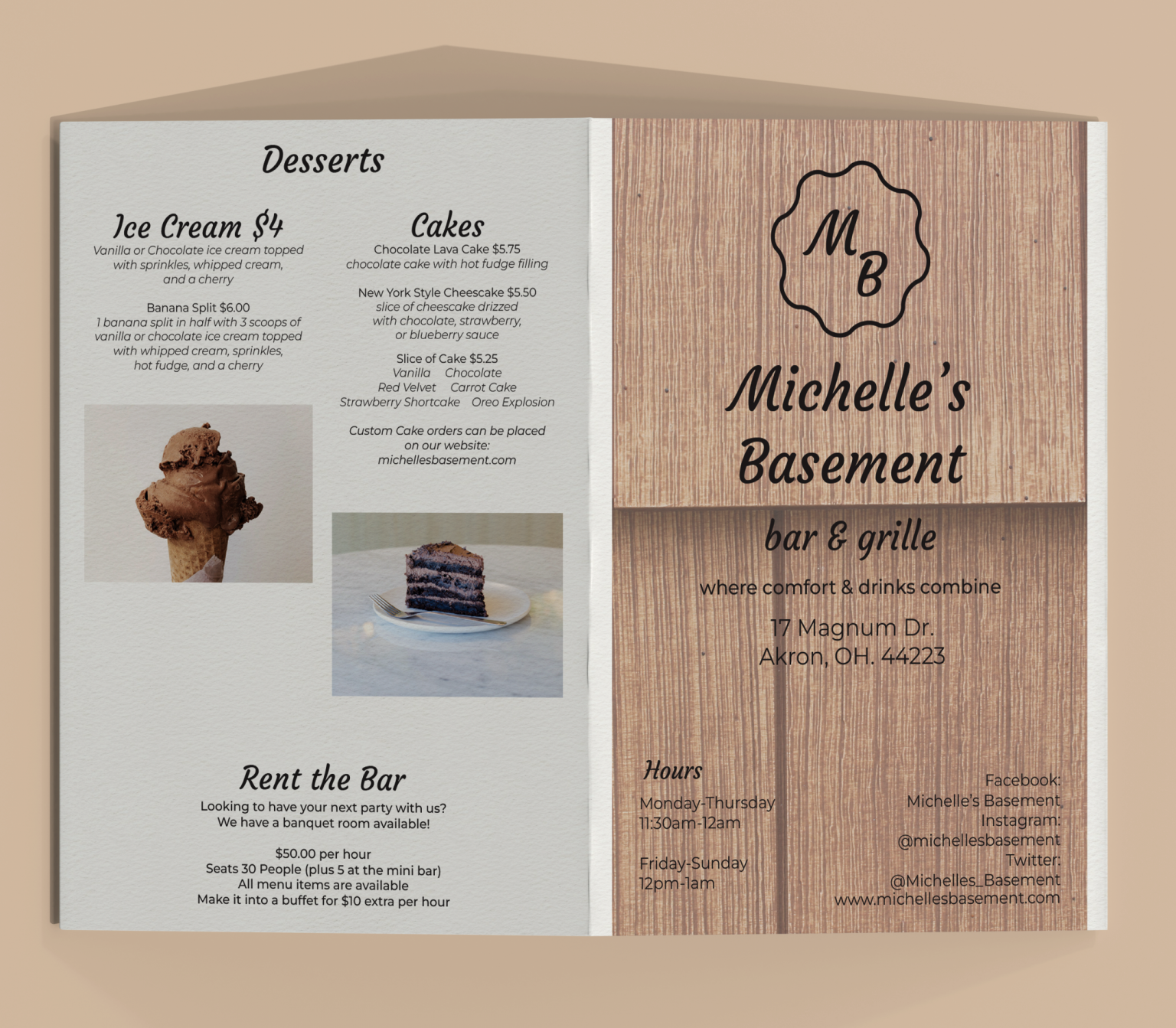
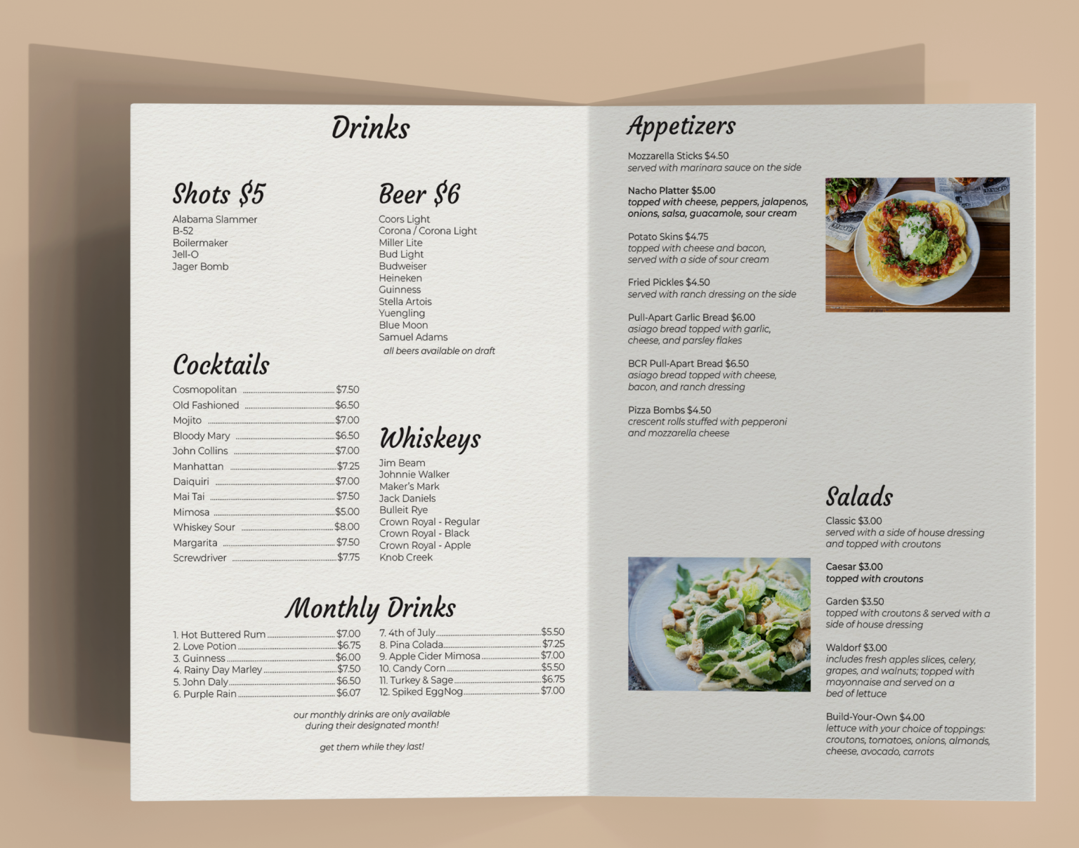
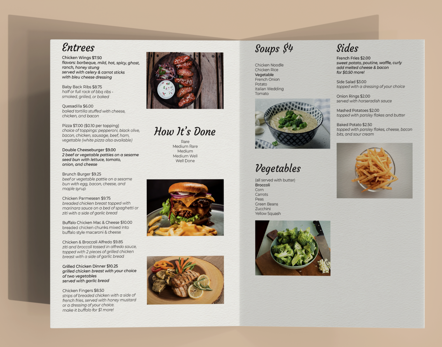
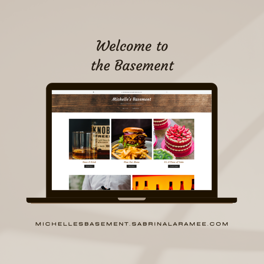
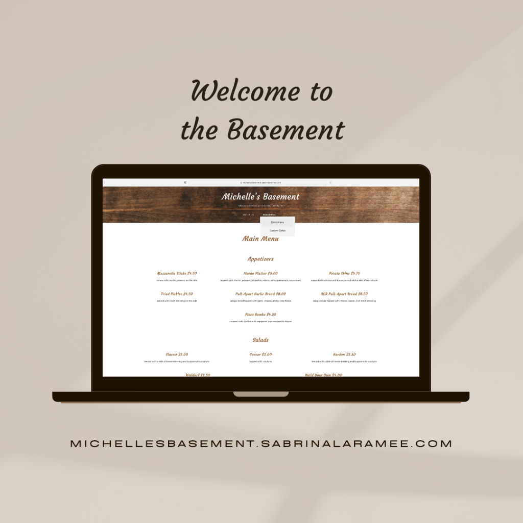
Menu design was something I became more interested in after working on projects such as Corsican. After that project, I resurrected a menu for a project that I had done a few years prior: Michelle’s Basement.
Michelle’s Basement began as a simple editorial project, getting to know Adobe InDesign better. After making changes to the menu a few years later, Michelle’s Basement became something better than what I envisioned when I first did the project. My inspiration for the menu was my mom, whose name is Michelle. I wanted to name a project after her, and this was my way of doing so.
The biggest goal I had when redoing this project was to fix all the prior issues, add menu items, add imagery, and create a better design for the menu. I wanted the menu to come back to life, but in a way that would make it better than the first version. After finishing the menu, I learned more about menu creation and organization. The final menu is much better than what I imagined when I first began the project.
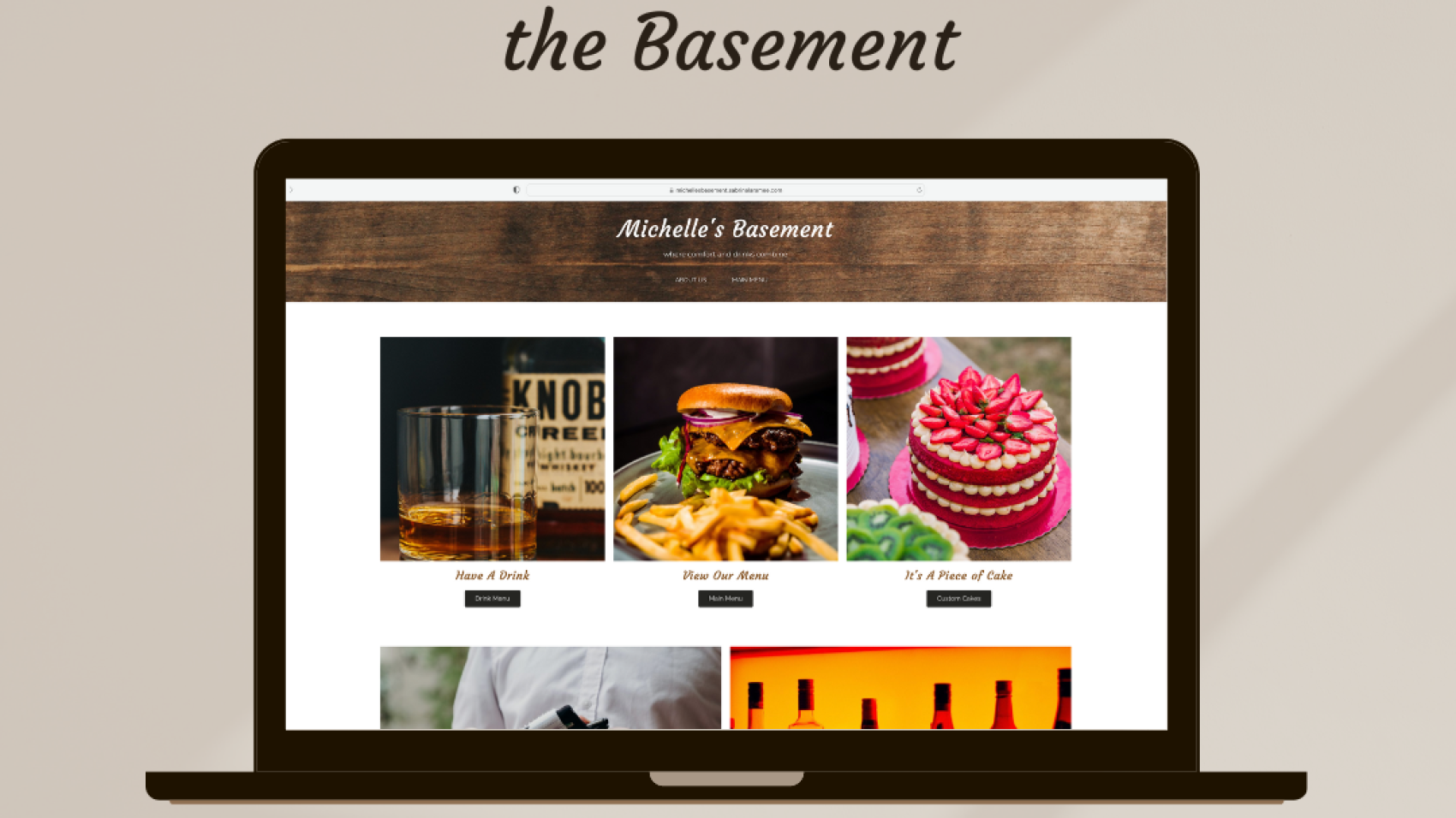
I extended the project by creating a full website. Michelle’s Basement deserved a website that would be cohesive with the original menu. The website elevates the menu, as it now has a digital ‘partner’ to complete the idea. With digital representation, Michelle’s Basement has once again become a staple project.
Creating a Capital Campaign was new territory. After this project? Not anymore.
Beacon Charter School was working on obtaining an abandoned church to expand its school and create a theater for the students to perform in.
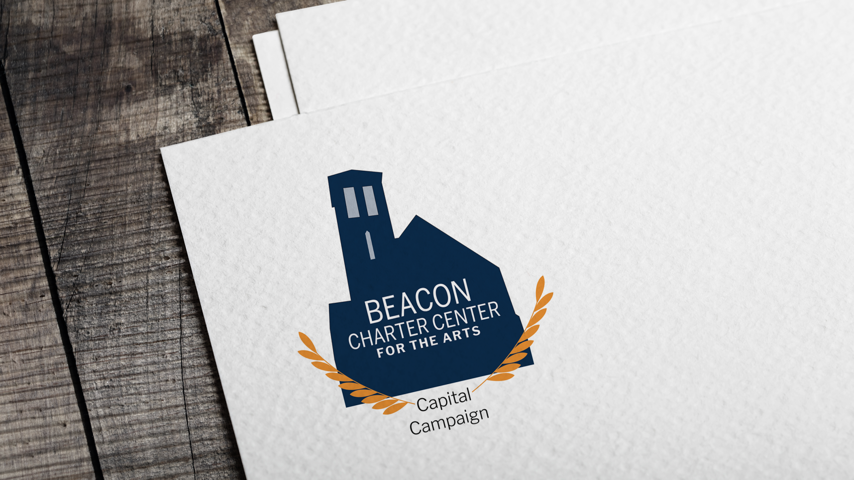
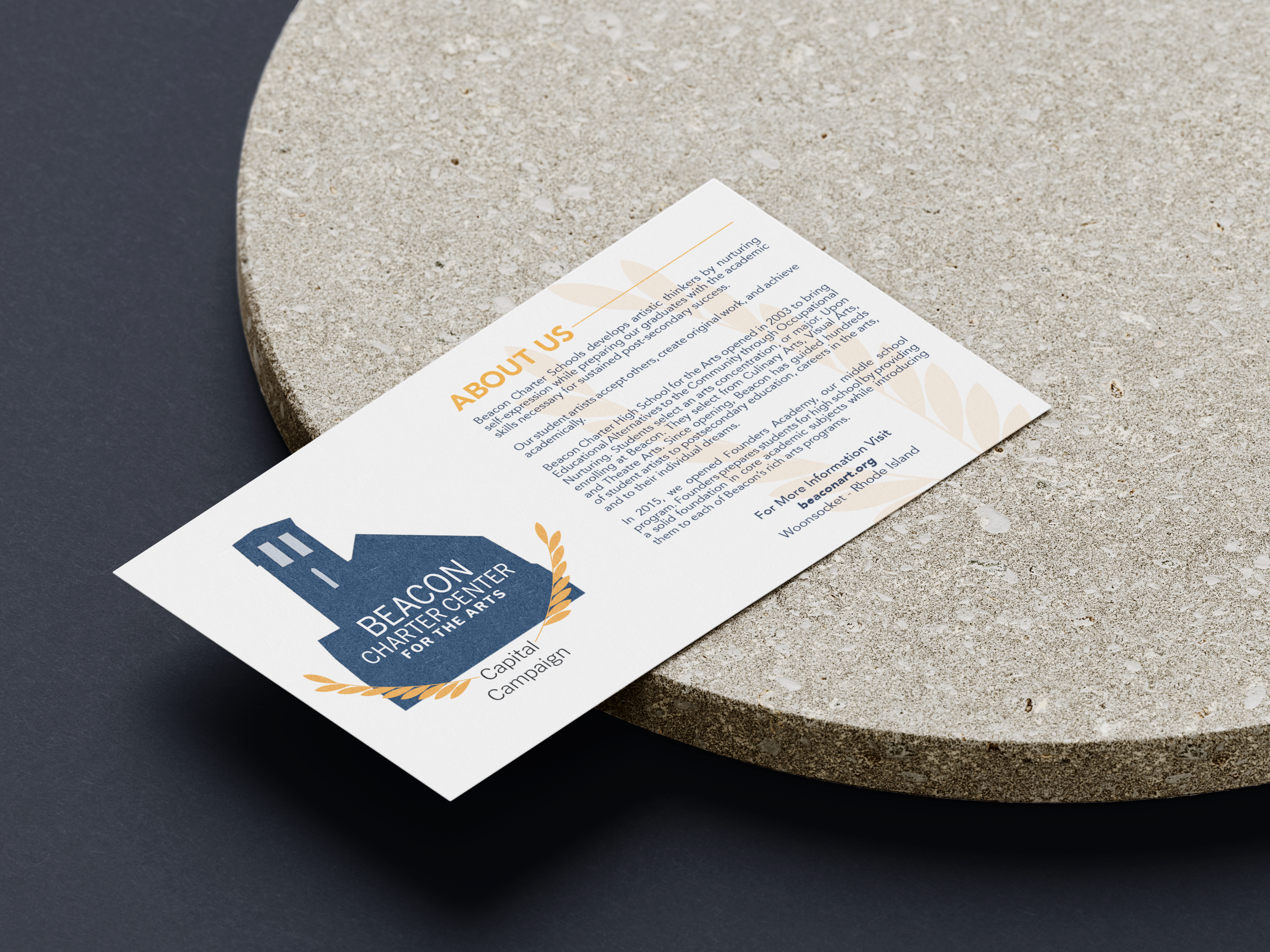
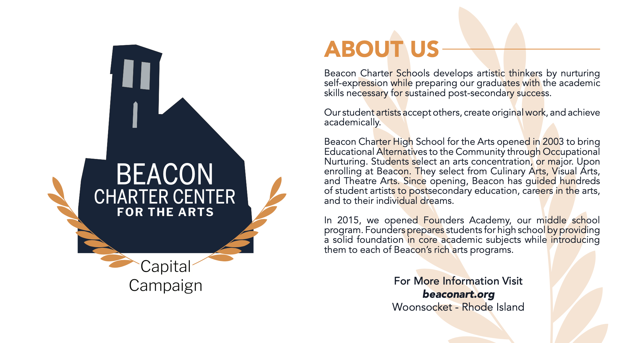
I and my design team partner, Justin Gecse, each created a logo and stylescape for the client. After meeting with them to show our initial progress, we refined our logos based on their feedback to create one final logo. The final logo is the shape of the church they were taking possession of, which was the main inspiration for us. After a logo was chosen, we worked on multiple brochure layouts that the client would choose from later to promote the new addition to the school: Beacon Charter Center for the Arts.
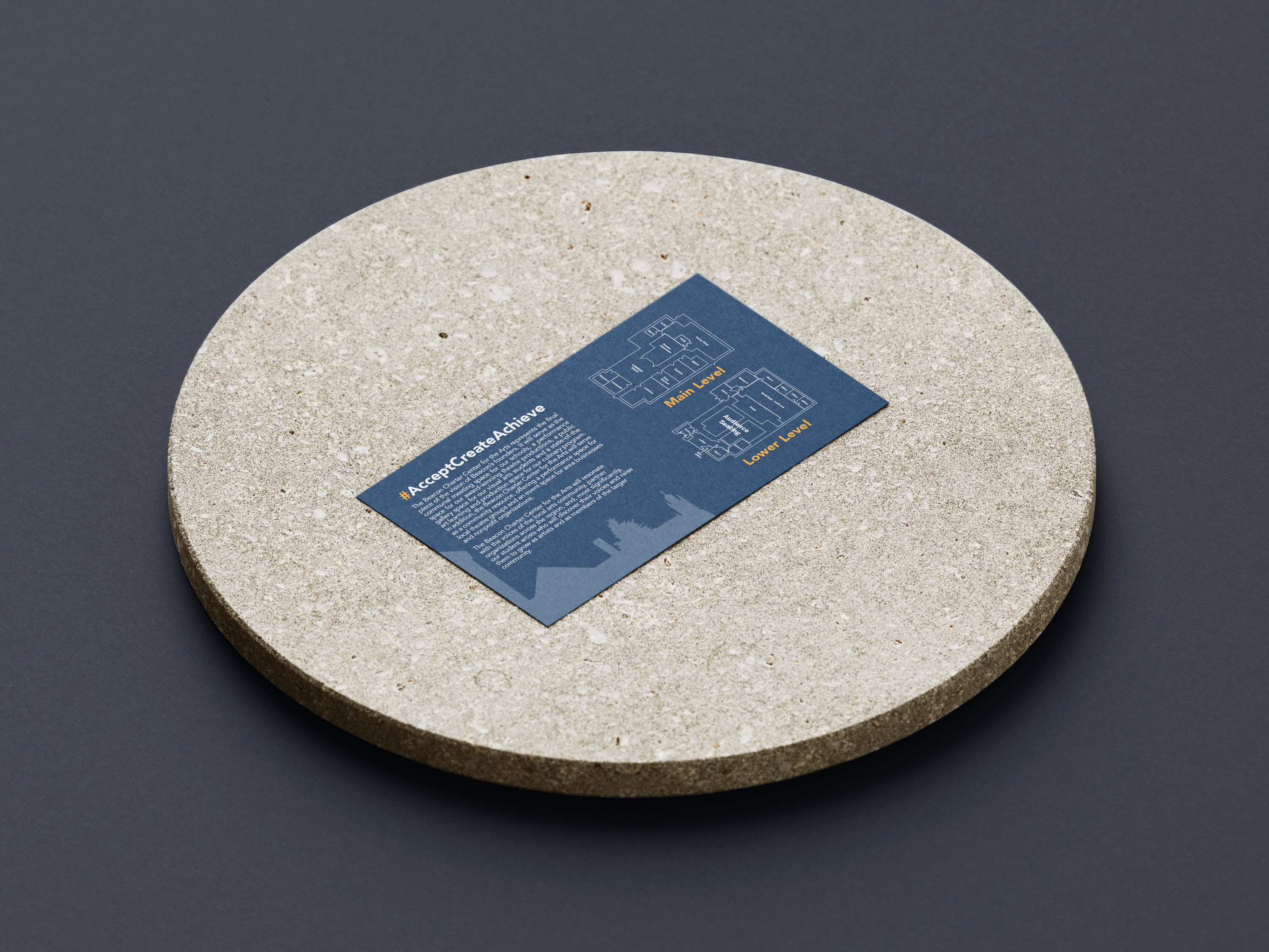
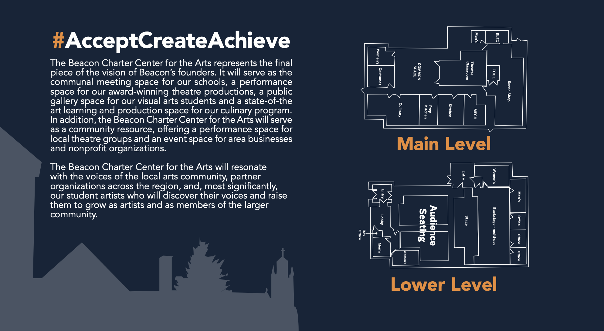
The client provided us with the textual content, I produced the updated architectural maps and final logo, and Justin formatted the postcard. The final product was the result of a wonderful collaboration between Justin and me. Our final piece came out greater than we imagined, and we loved every step of the process.
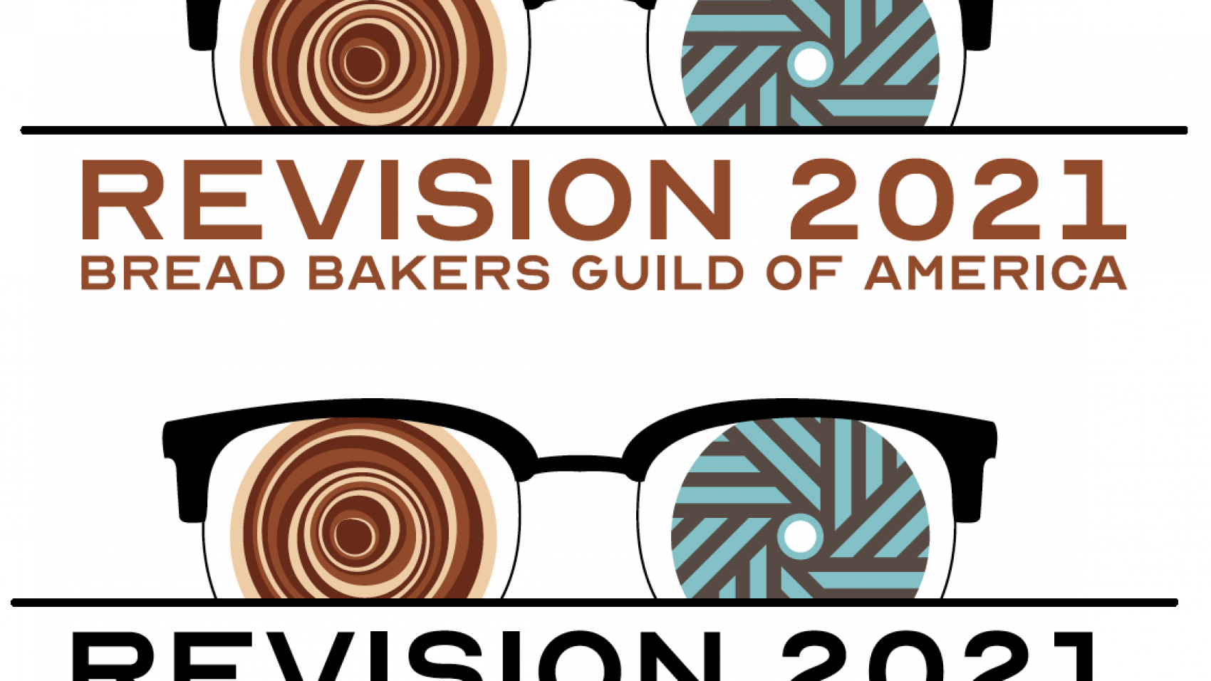
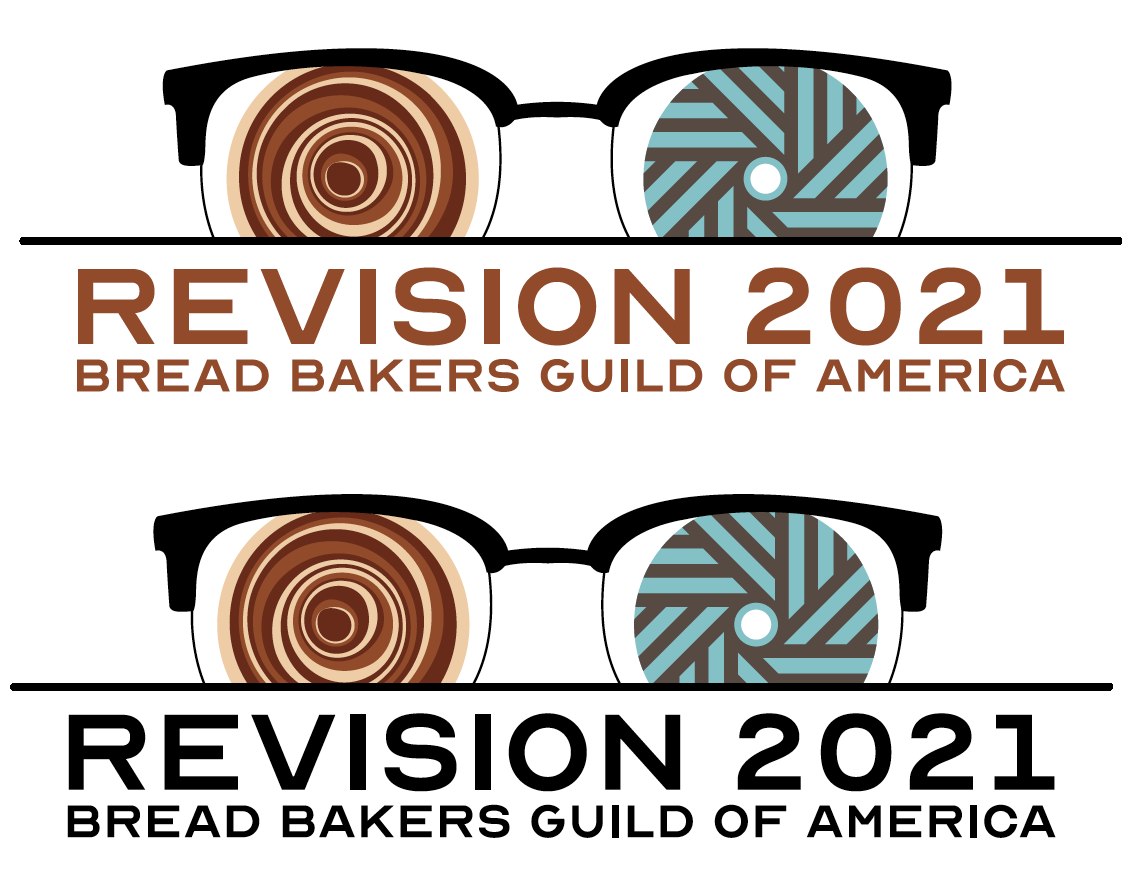
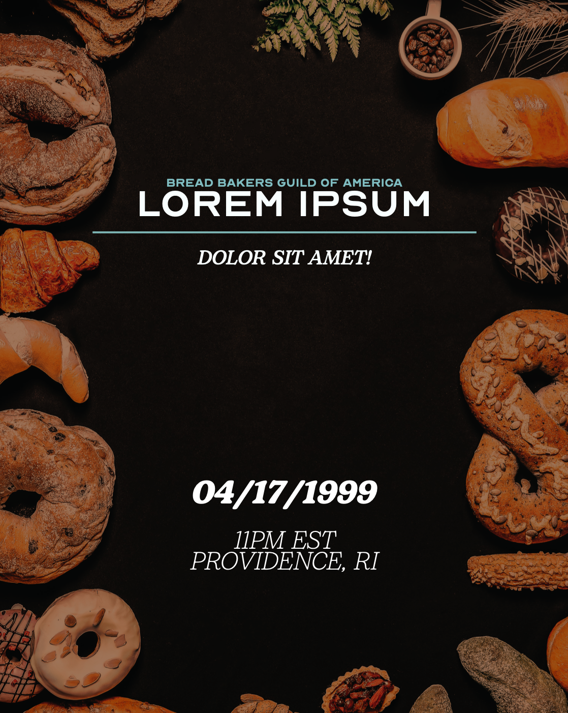
Create branding for the event series, ReVision 2021, for Bread Bakers Guild of America.
tools used:
Adobe Illustrator
My first college client project…and I get to do it on bread? Okay!
It wasn’t exactly working with bread but rather working with the Bread Bakers Guild of America. The first half of the project was developing a logo for the 2021 event series hosted by the Bread Bakers Guild of America, ReVison. Due to their 2020 series being canceled due to COVID, they decided to carry that theme over to 2021.
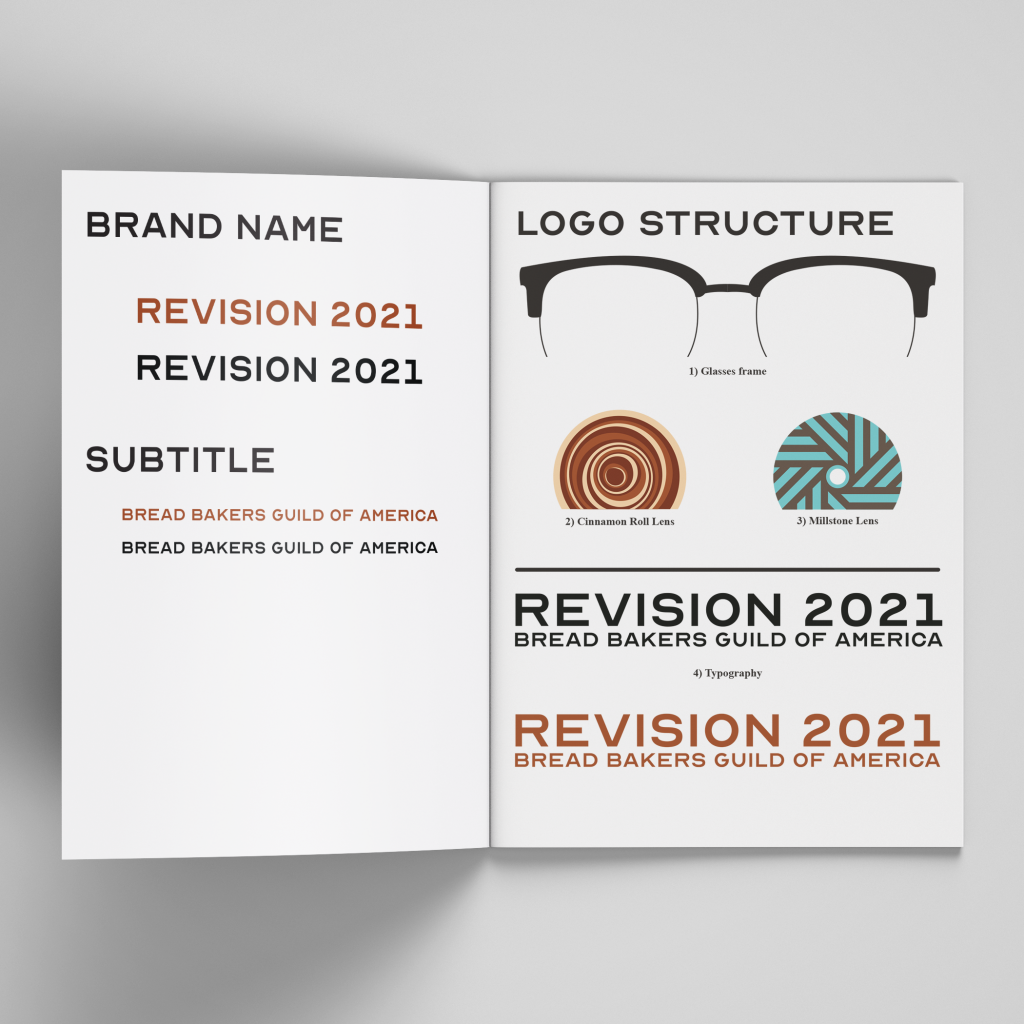
The logo for ReVision was born from an idea about putting a cinnamon roll in a pair of glasses. Not literally, of course. The idea came from the client, and I decided to run with it. After multiple versions were done in Adobe Illustrator, we finally hit the mark, which became the final logo. This project was done in a team, and we each have an element within the logo that we created. The layout was created by me, the glasses frames and cinnamon roll by Justin Gecse, and the blue and grey millstone by Nolan Badore.
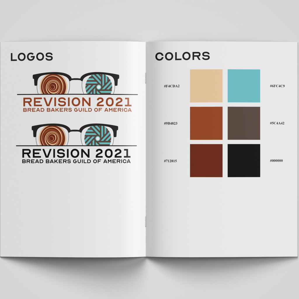
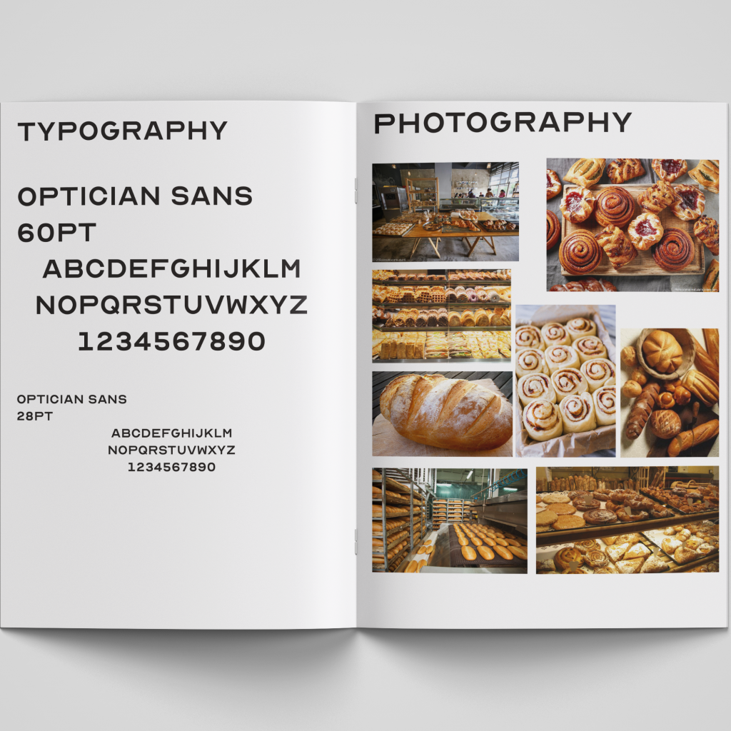
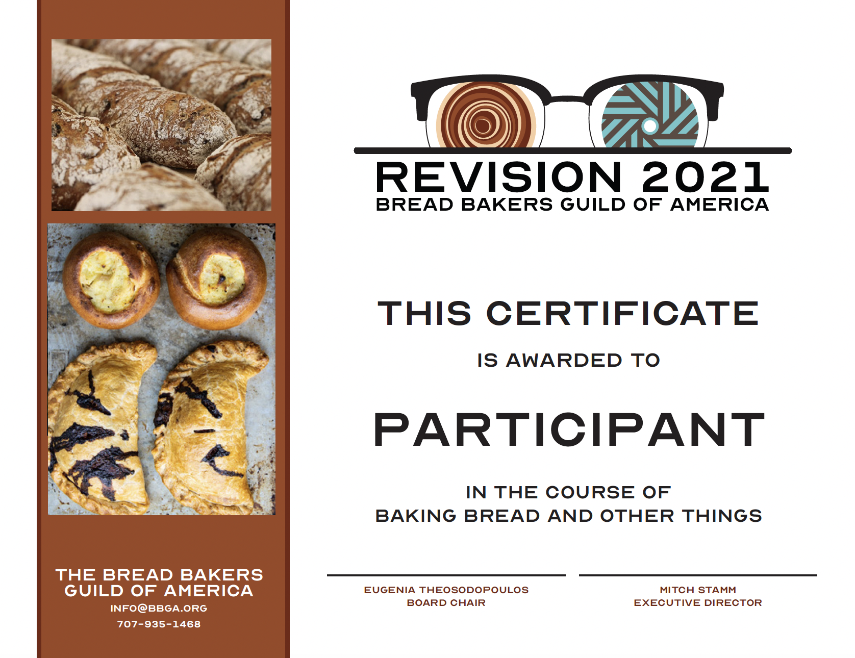
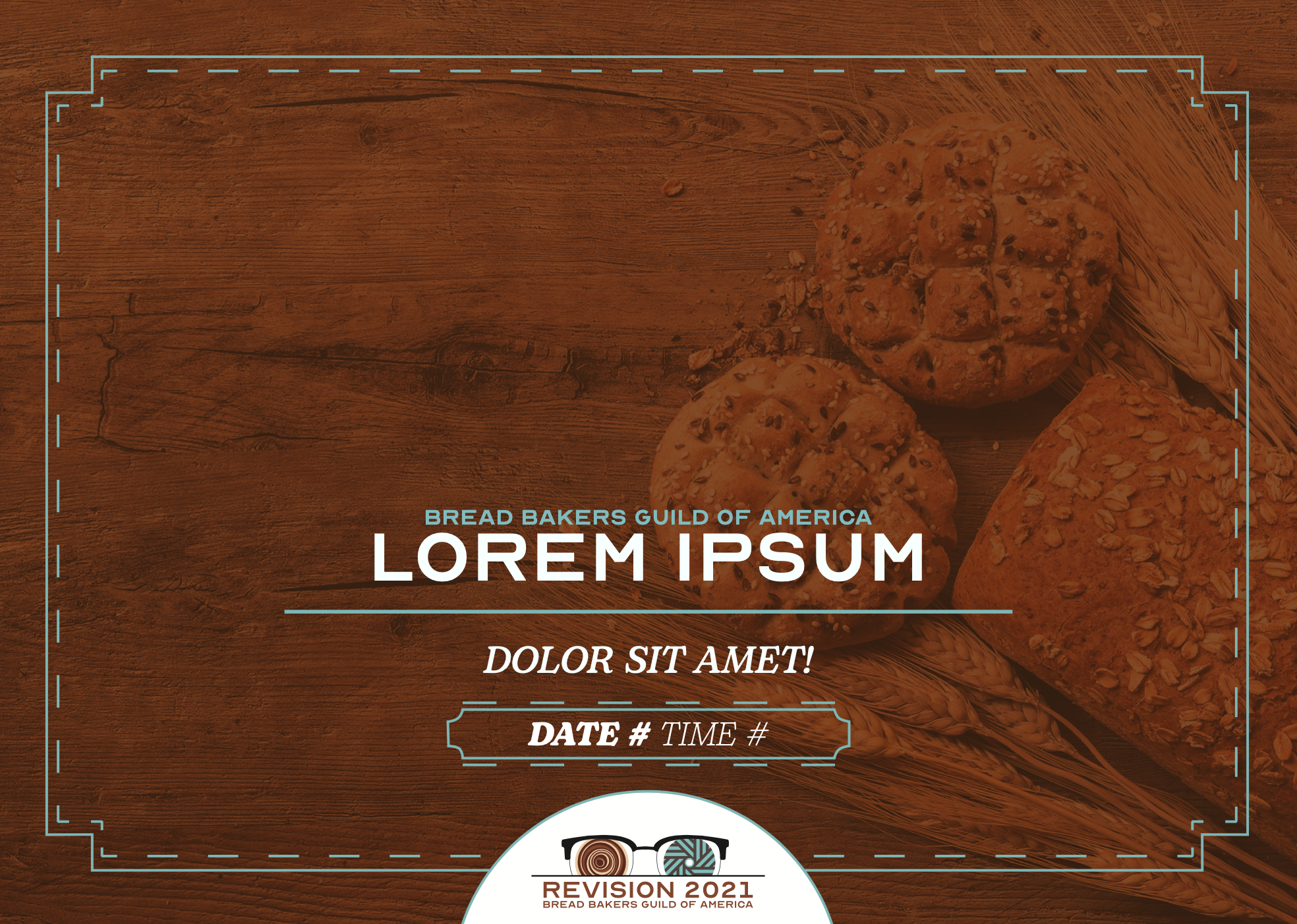
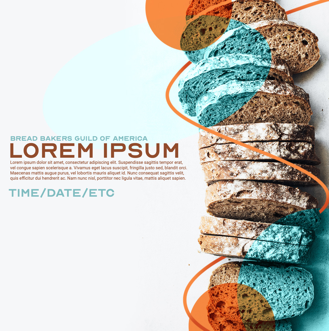
After completing the logo, the second half of our project focused on creating Instagram posts to advertise the event series, certificates of completion for the students, and a brand guide that broke down every piece of the logo. Nolan Badore created the editable Instagram posts, Justin Gecse created the certificates, and I pulled apart the logo to create the brand guide.
Working with Bread Bakers Guild of America has taught me much about branding, brand identity, and involving the client in every step of the process. The final piece means a great deal to me because it shows that one crazy idea can turn into an awesome logo.
Find an existing website and redesign it. Make improvements to the site as well as put your own twist on it.
tools used:
Adobe Xd
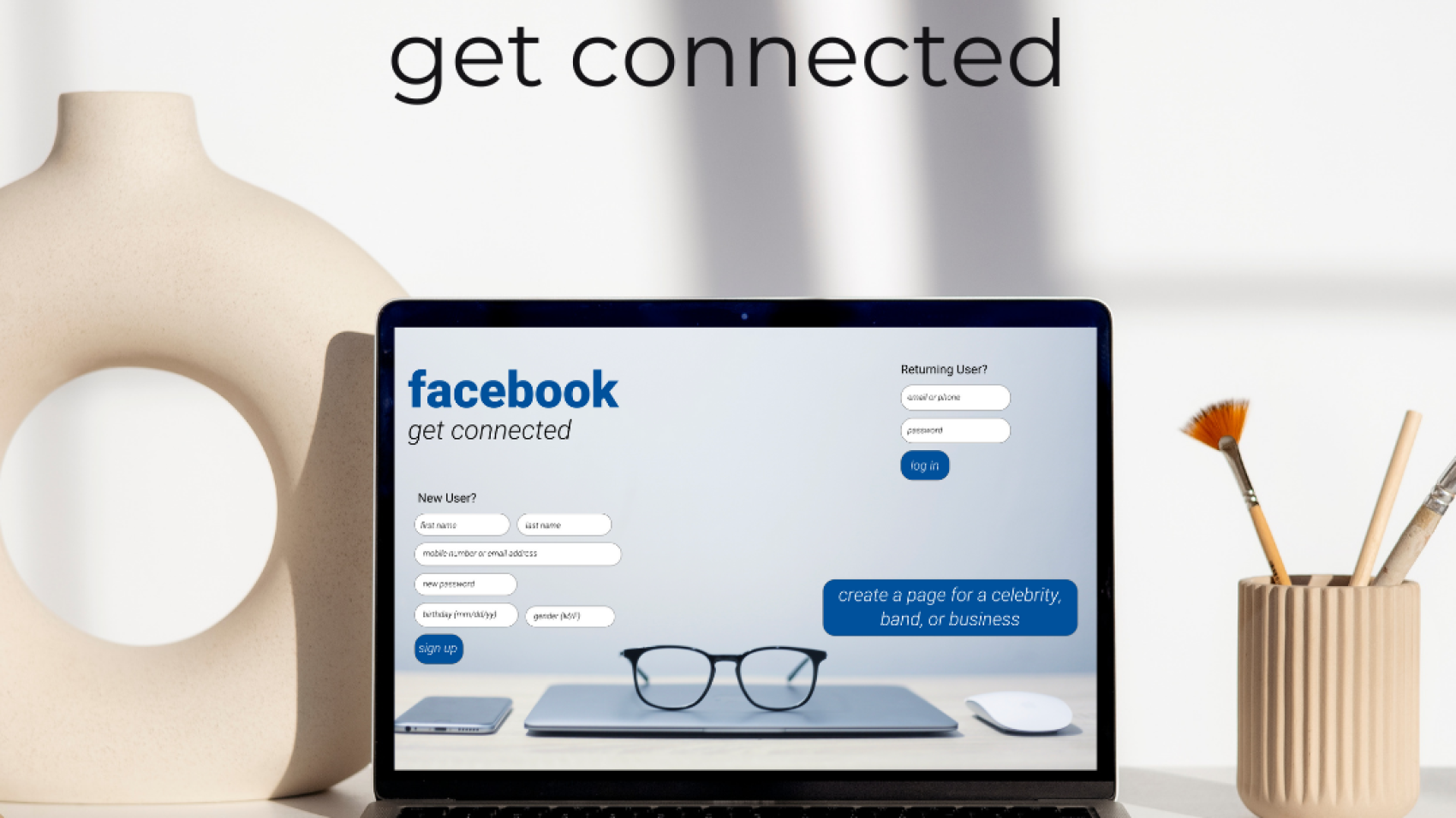
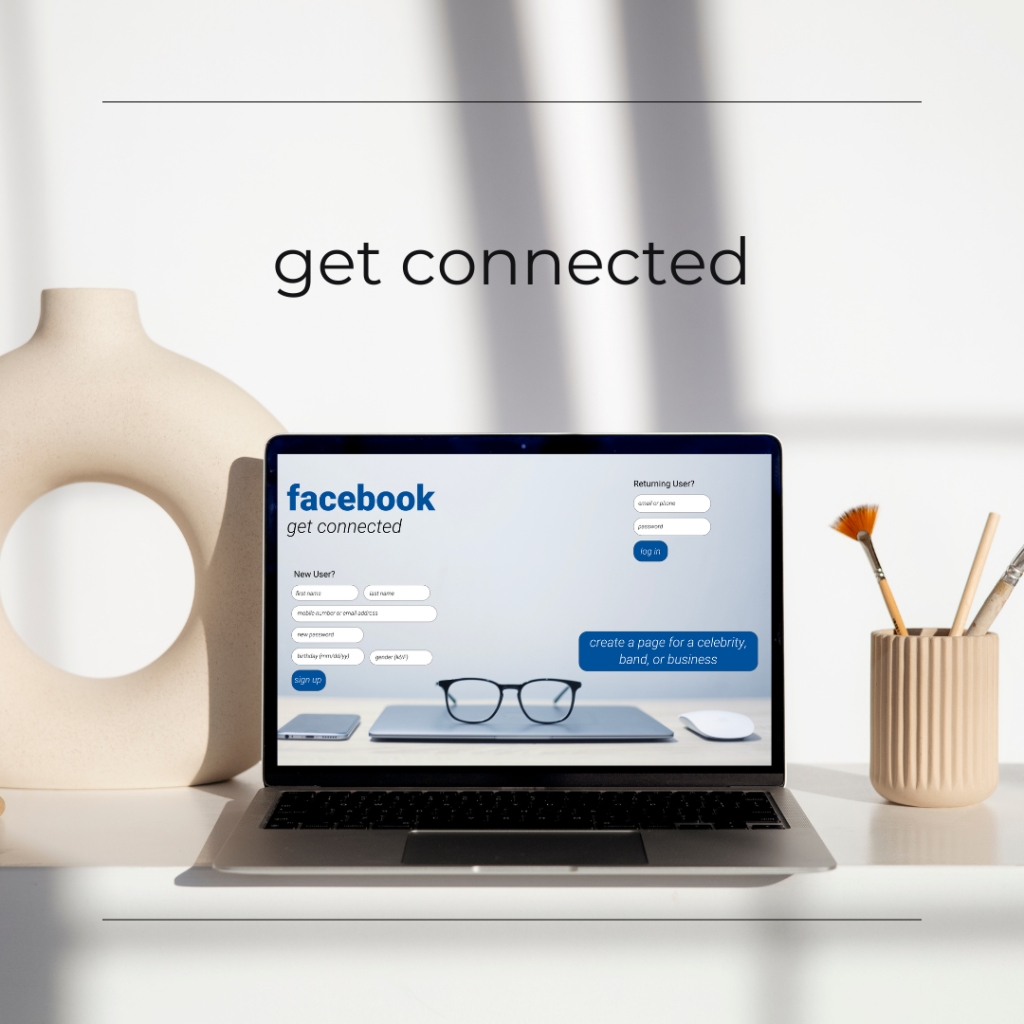
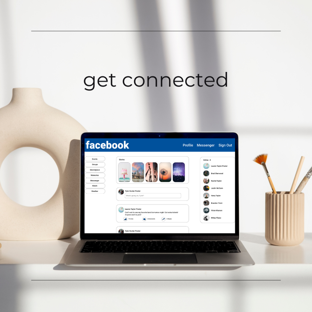
Social media sites that don’t update to fit with the times can end up losing a lot of users or end up being replaced by another social media site. This project involved redesigning a website to make it more modern, fixing any issues with the design, and putting one’s own twist on it. My choice was Facebook.
My redesign of Facebook began in Adobe Photoshop and ended in Adobe Xd. The original project called for the redesign to be done in Photoshop, but I wanted something that worked. Later, I did the project again in Adobe Xd. My inspiration for the project was solely my own creativity and Facebook’s color palette. My goal was to turn classic Facebook into sleek, modern, upscale Facebook. The second version turned out to be much better than the first, including much more detail. This piece will influence future works that involve Adobe Xd.
Create a microsite for a brand you developed. You are welcome to use an existing brand as a client.
tools used:
HTML/CSS/PHP
WordPress
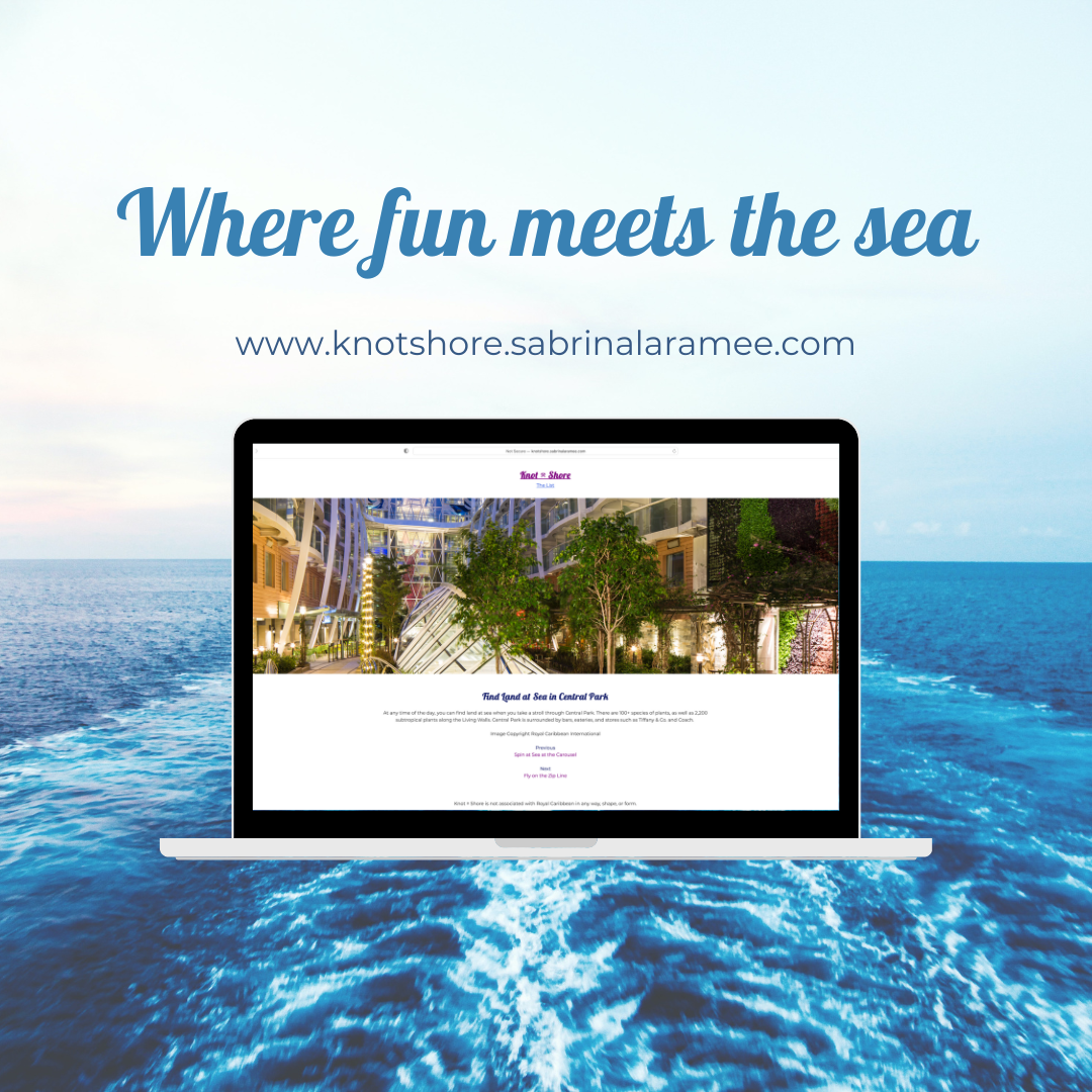
Usually, when I’m given an objective for a project, I have ideas that I can run with. This project was not one of them. The project’s name, Knot Shore, is the result of me literally not being sure of what I wanted to do my project on.
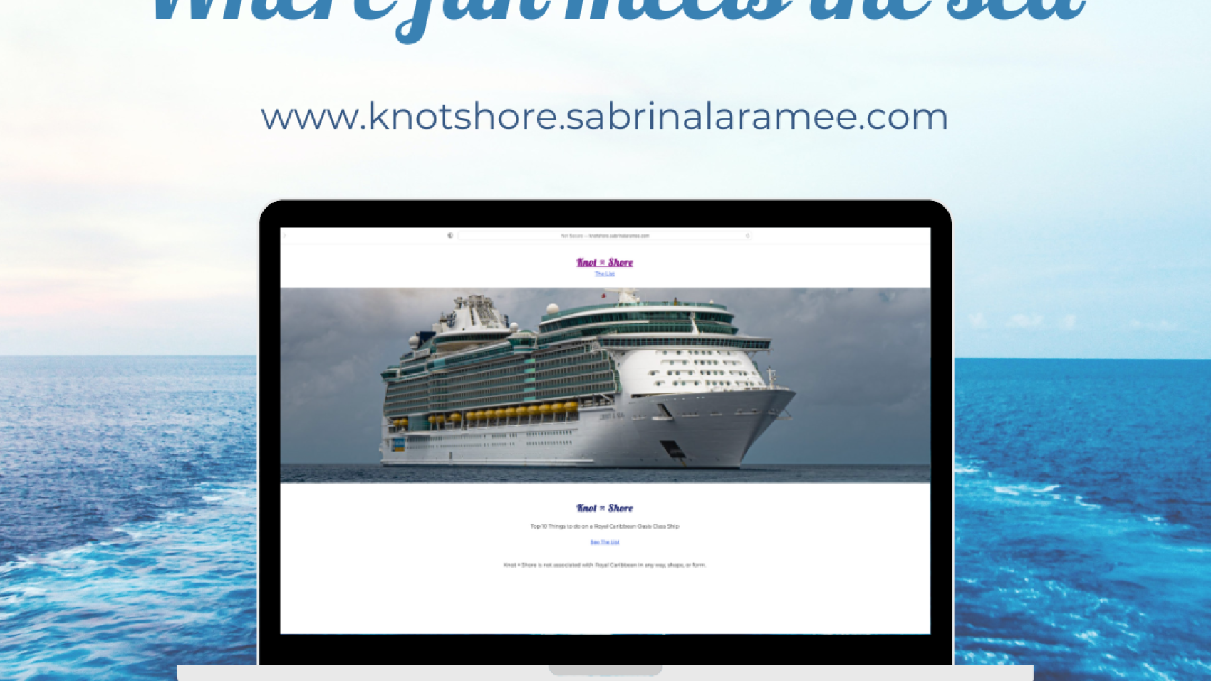
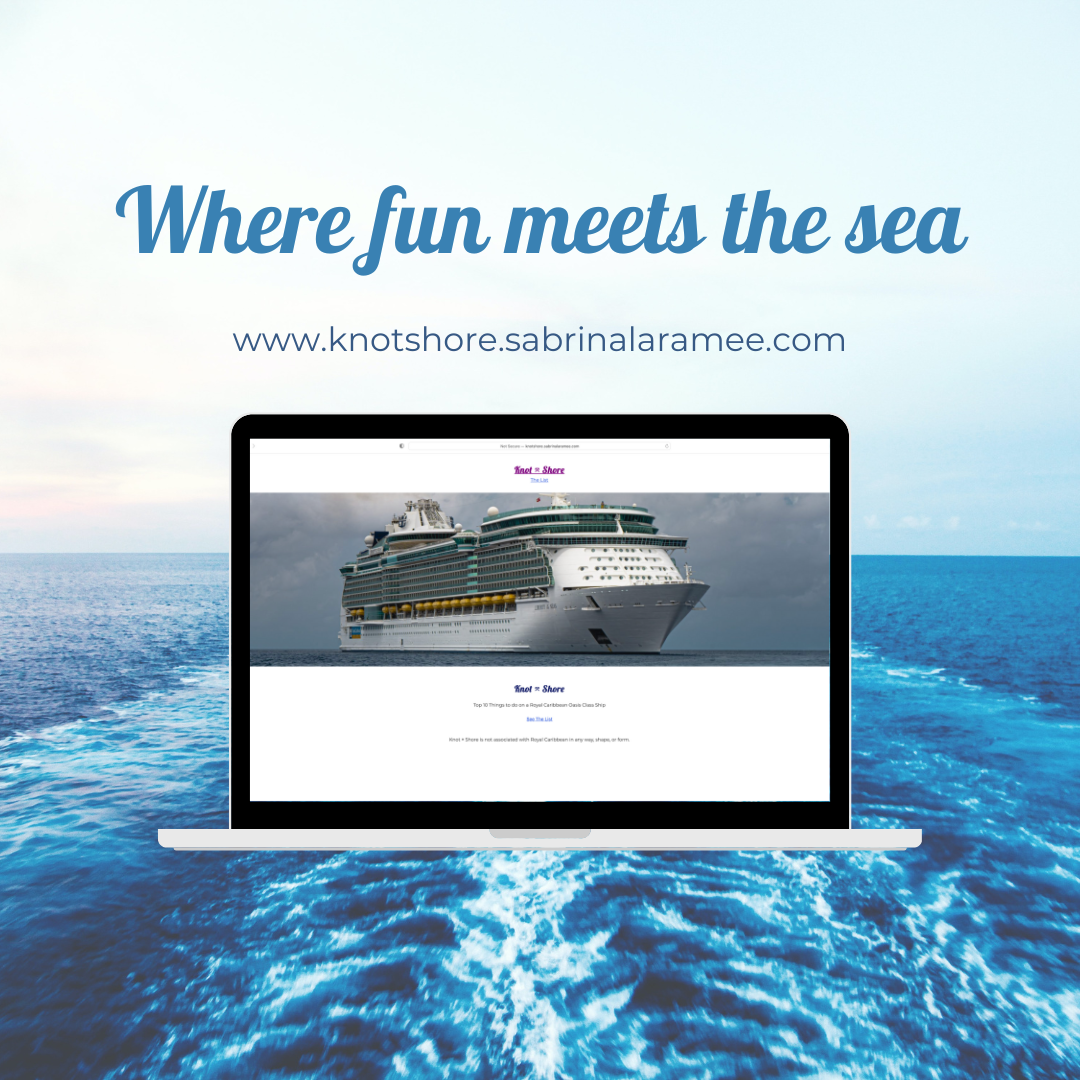
The objective of the project was to create a microsite for a fictional brand with an existing company as I client. The microsite was to include a “top ten” list of features from that company. After finally deciding on my project theme, I chose Royal Caribbean as my “client”, although the site is not affiliated with the brand.
My project theme was about the top ten things to do on a Royal Caribbean Oasis Class ship. I created the site entirely in code with HTML, CSS, and PHP. PHP was my biggest hurdle in this project. My goal was to get over that hurdle. The process of creating the site with PHP was a roller coaster, but a great learning experience nonetheless after spending three hours on Zoom with my professor on how to do the site in PHP. The final site is something I will always tell the story of, and it came out much better than I ever imagined when I started. Knot Shore will become a model for future projects that absolutely need to include PHP. Otherwise, it will be shown as my favorite project I’ve ever done.
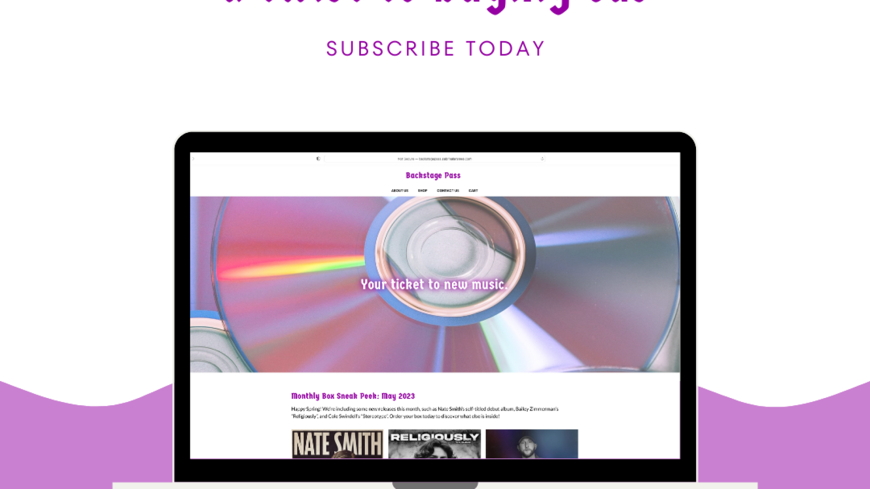
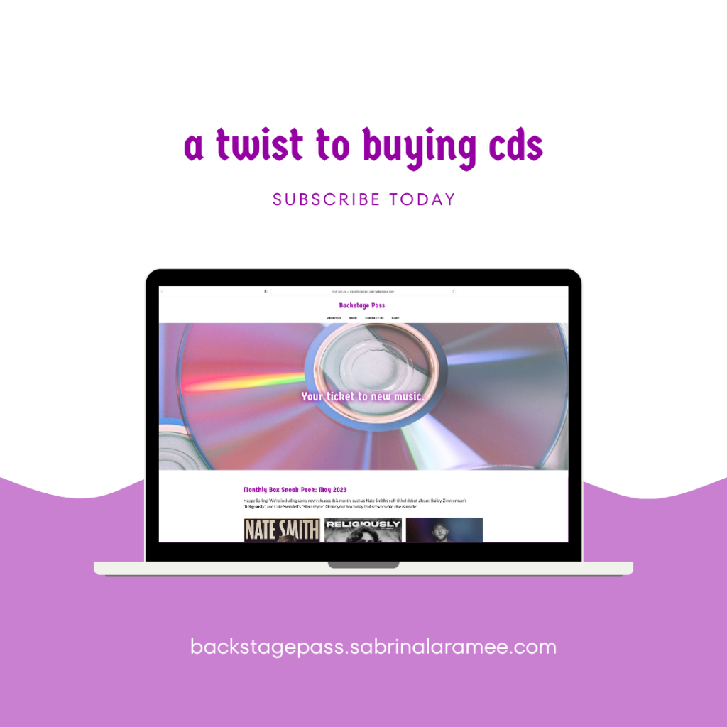
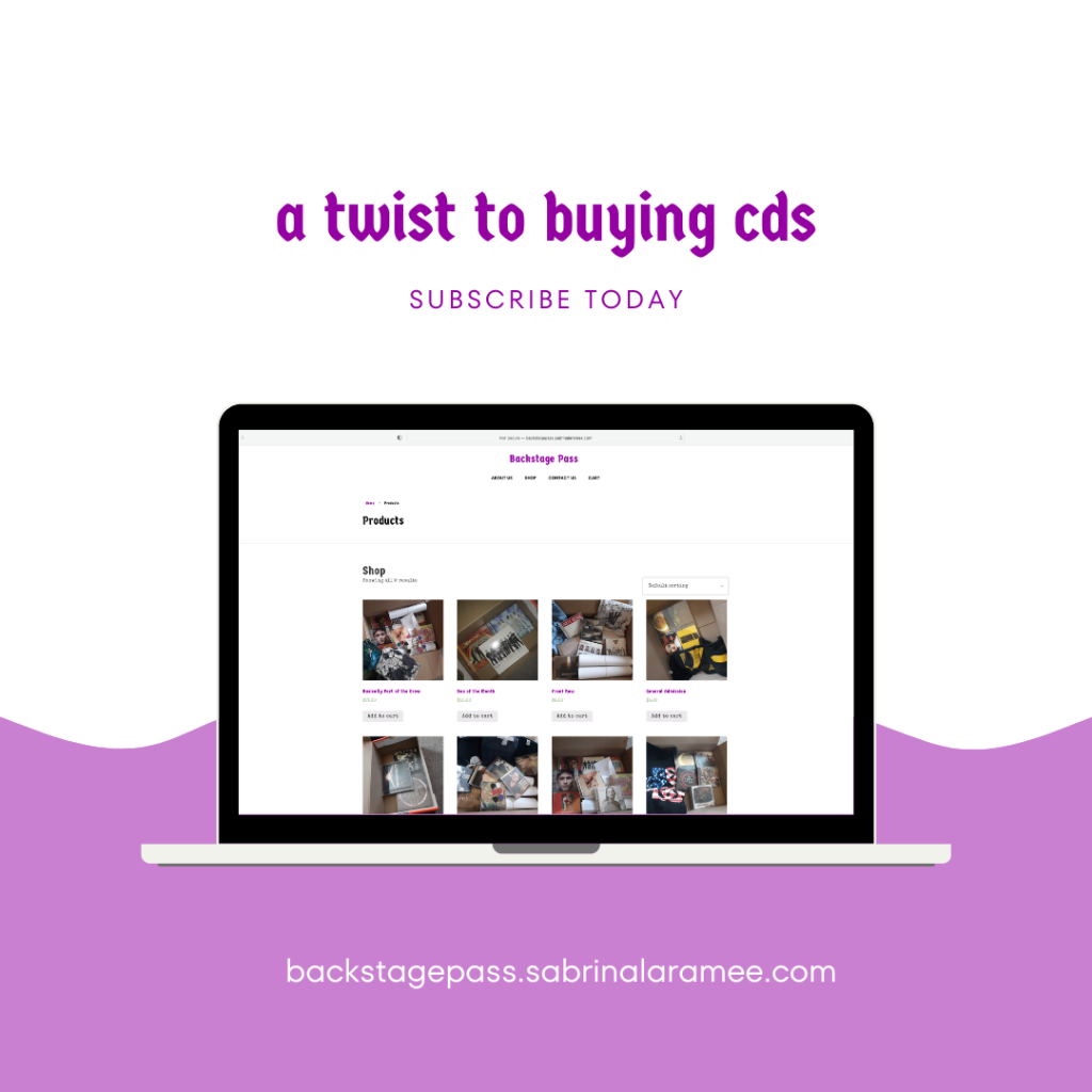
Subscription boxes are boxes you can get monthly, packed with goodies based on a monthly theme. I incorporated my love of music into this project, creating a site that sends subscription boxes filled with CDs. Backstage Pass is the name of the site, as it sends the message that it feels like you’re going backstage to get to know an artist through their music.
My biggest inspiration was my love for music and my big collection of CDs. I used this to my advantage in this project, even photographing some of them for the project. My goal was to show that CDs are not going out of style. I wanted to explore what I could do when I crossed my CD collection with creating a website. Backstage Pass was the result. The final site was more than what I had envisioned.
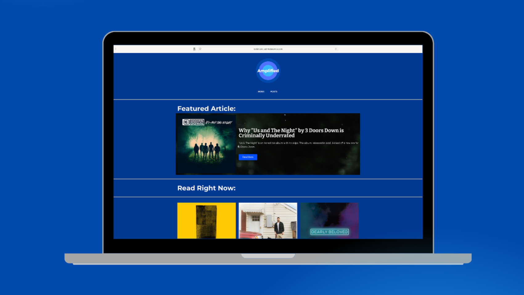
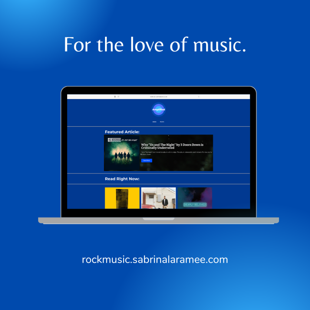
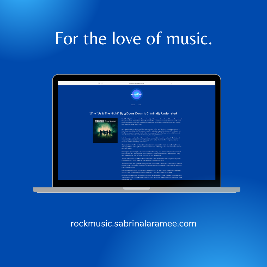
My first blog was something I had to do for a project, but later became a site that I keep updating. It was first named Rock Music in 2019 and renamed Amplified the following year.
The purpose of the blog is to share my opinions on albums that have made a big impact on me. The main inspiration for Amplified is Loudwire, a popular rock music news blog. I wanted to have a similar outlet, but one more opinion-based. My goal for Amplified is to have a space to talk about my love of music that has impacted me, even if it doesn’t get readers. Amplified, even though it gets updated often, is much better than what I originally envisioned for the site. Amplified has given me a space where I can talk about what I love.
Create a website for a boutique hotel with a self-chosen theme.
tools used:
WordPress
Elementor Page Builder
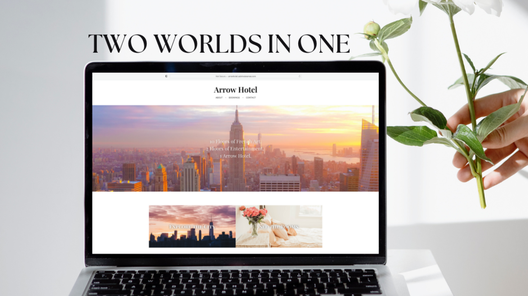
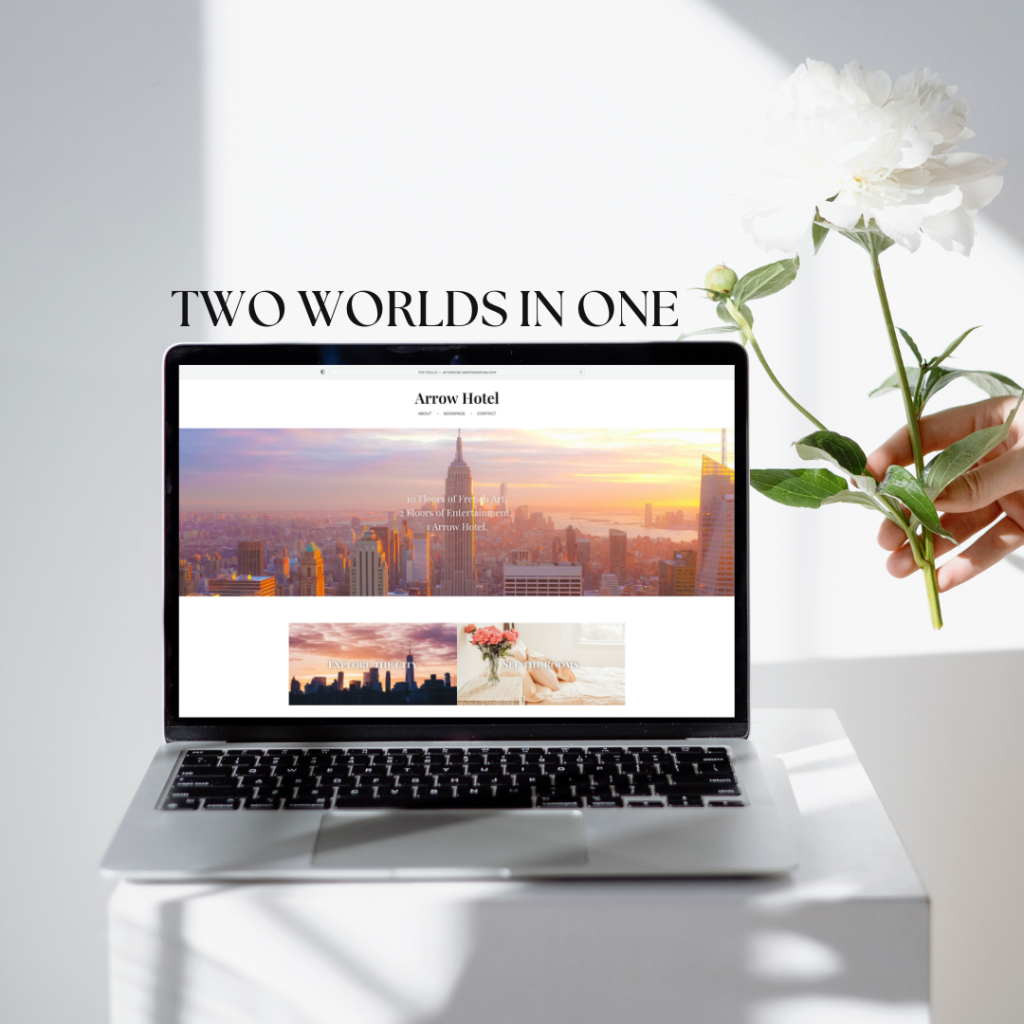
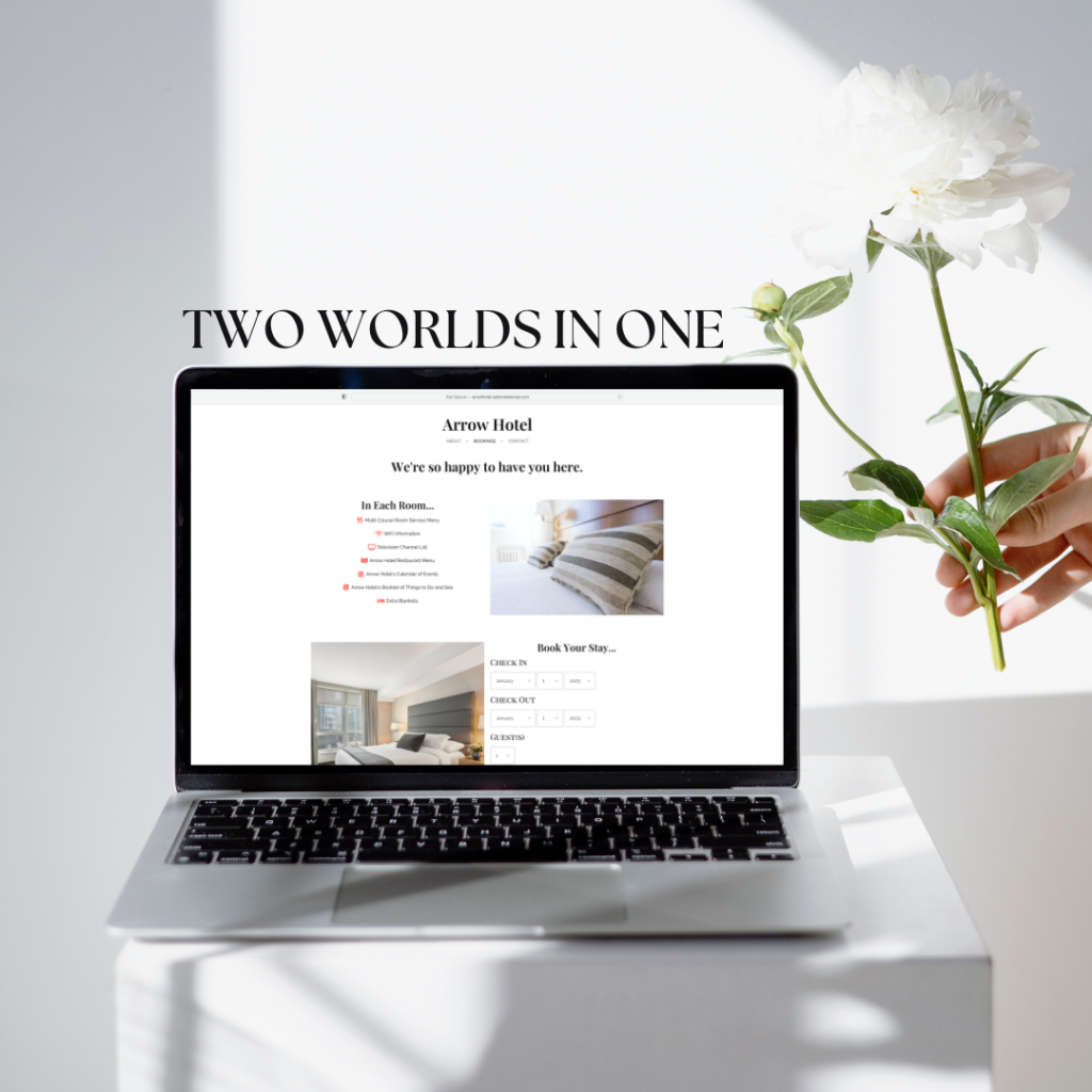
If you’ve ever stayed in a hotel, it’s obvious that all the rooms look the same, the floors look the same, and even the artwork from floor to floor is similar. This project throws all of that out the window. For this project, the task was to create a website for a boutique hotel. Thus, Arrow Hotel was born.
I created Arrow Hotel with a challenge for myself in mind: use Pantone’s 2019 color of the year, Living Coral, and create my theme from that color. The color was bold and comforting, so I ran with the theme.
My biggest inspiration for the site was bringing together stunning French artworks and the upscale New York City. My goal was to create a site that invoked the feeling that you were in Paris and New York City simultaneously. This website achieved more than just that one goal. Arrow Hotel quickly became the project I’ll never regret.
Create a nonprofit campaign for a good cause. Design the brand, company, and advertising.
tools used
Adobe Photoshop
Adobe Illustrator
WordPress
Elementor – Page Builder
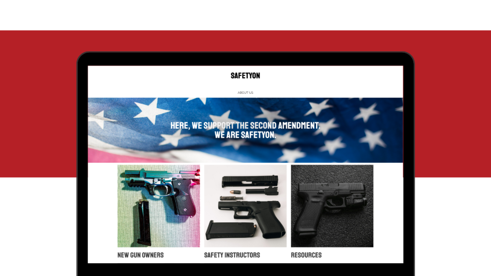
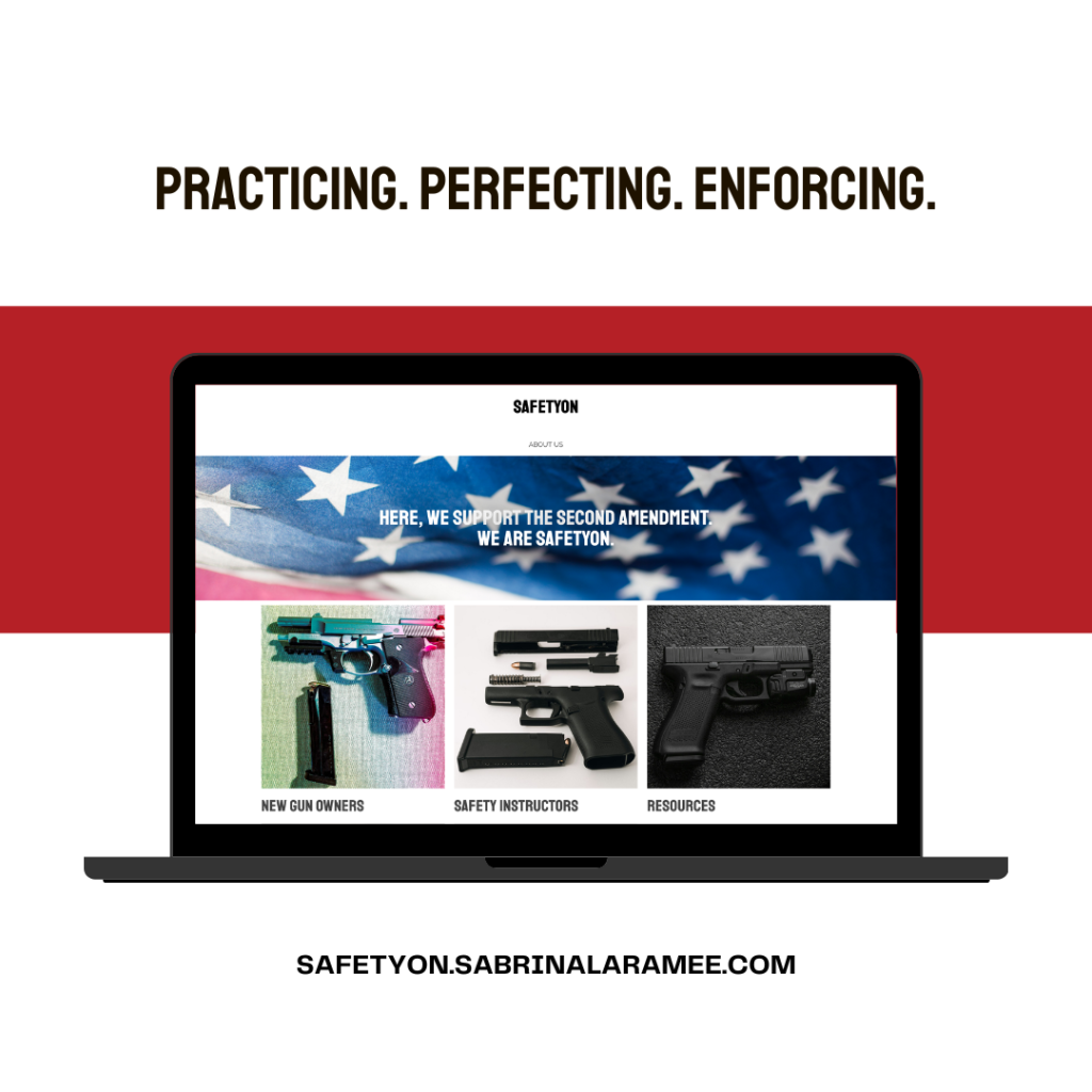
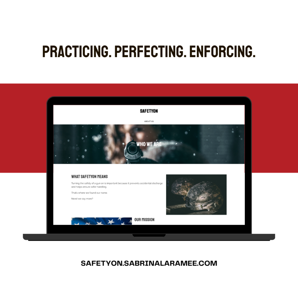
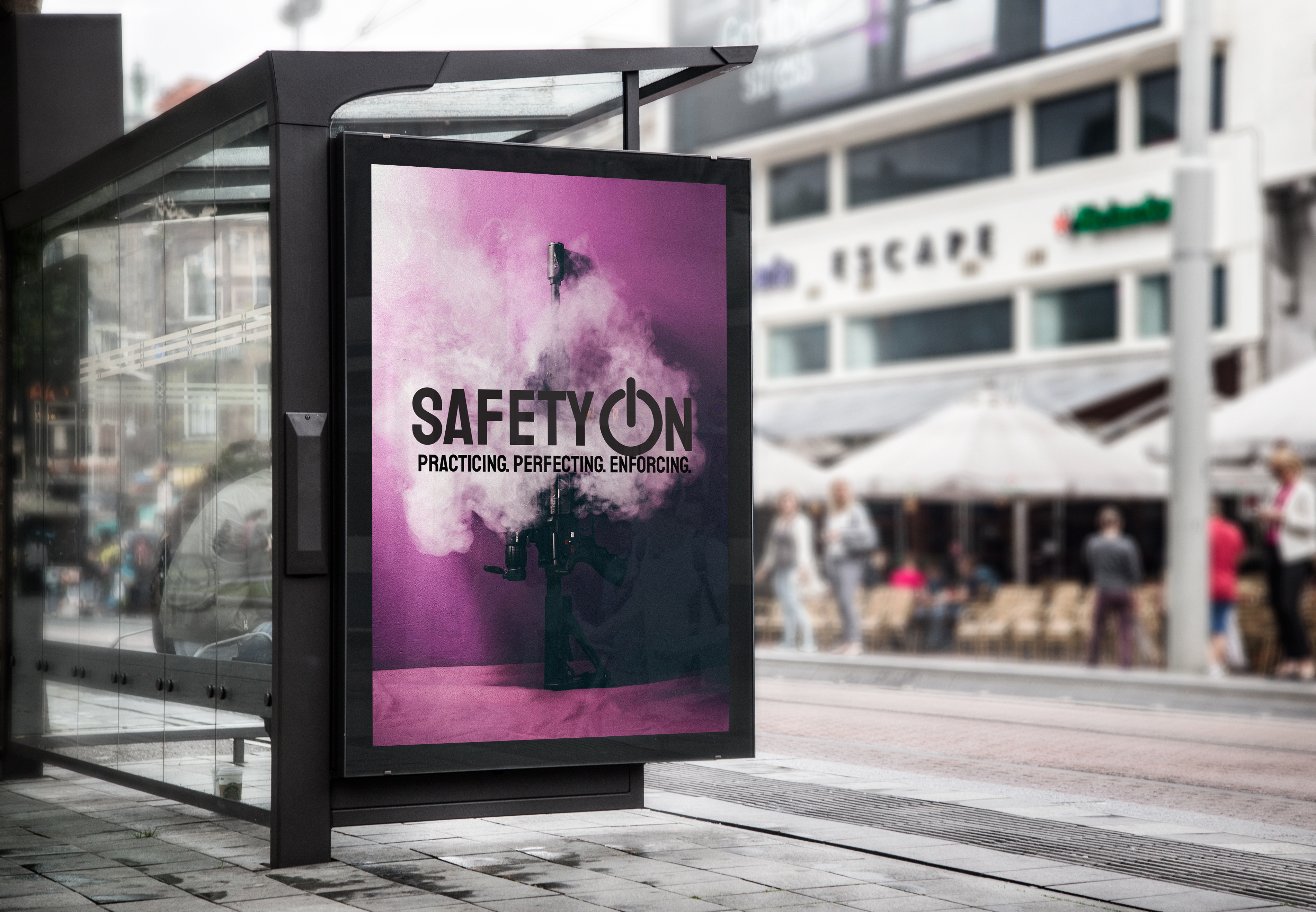
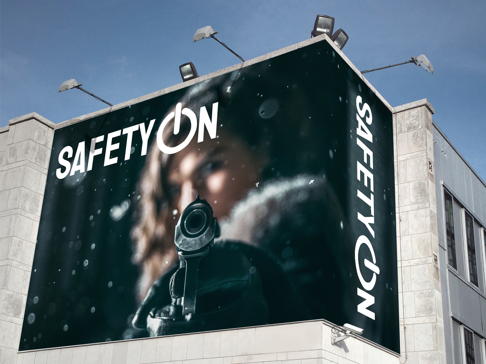
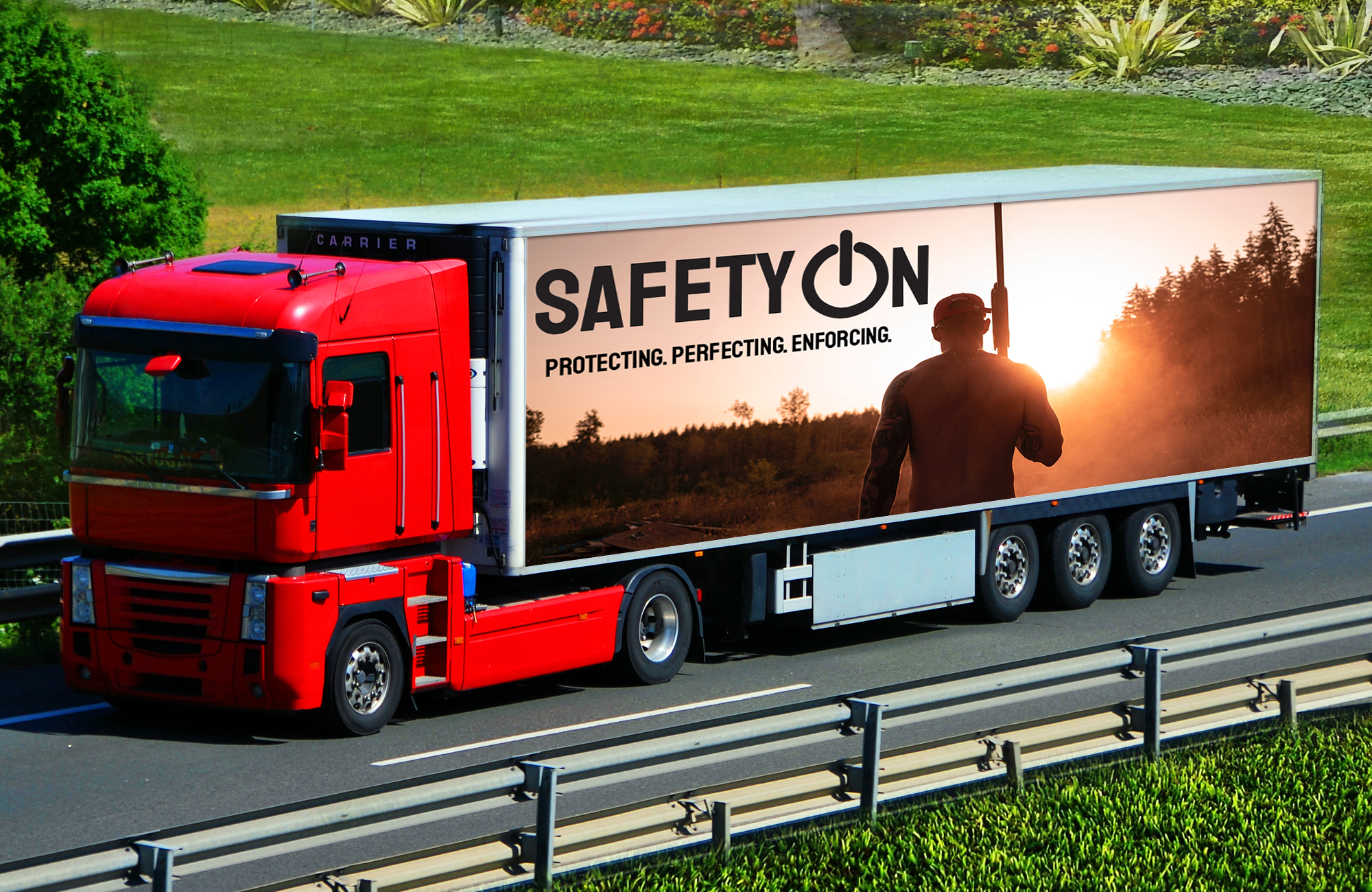
A project about designing for good is what lead me to create SafetyOn. SafetyOn is a nonprofit company that promotes positive gun use, and proper education, and enforces the correct use of guns. The mission is to educate people about the safety, proper use, and laws about guns and ammunition.
SafetyOn is a project created with WordPress, which gave me complete creative freedom. My inspiration was my stance on gun rights, and I wanted to develop a message that focused on the positive attributes of guns. SafetyOn aims to cater to lovers, haters, and owners of guns and ammunition. I used this project with the goal of educating people in mind.
While developing the campaign, I learned so much more about proper protection, use, and very interesting facts. Creating SafetyOn has taught me so much, and I have continued to learn thanks to my research for the project. I hope to continue developing this project, such as updating the website for the brand and keeping it up to date on what’s happening in the gun world.
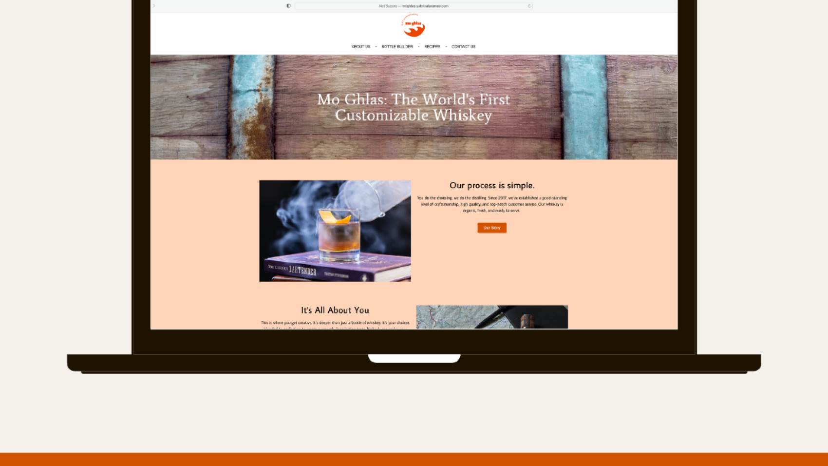
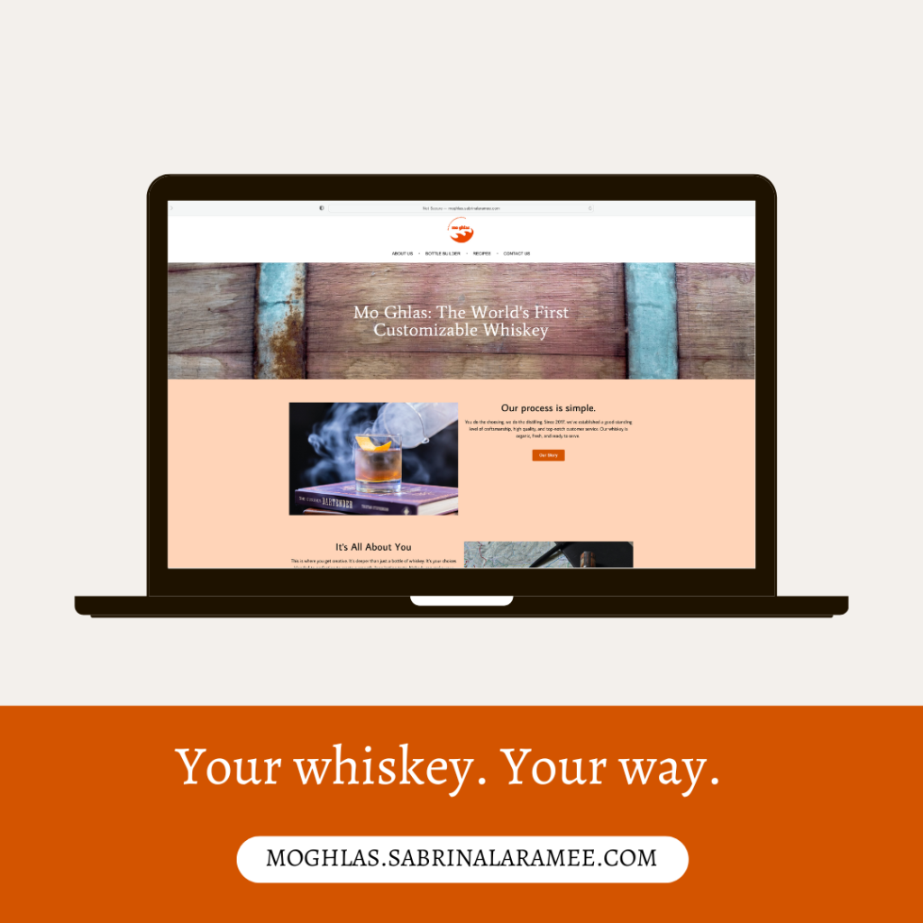
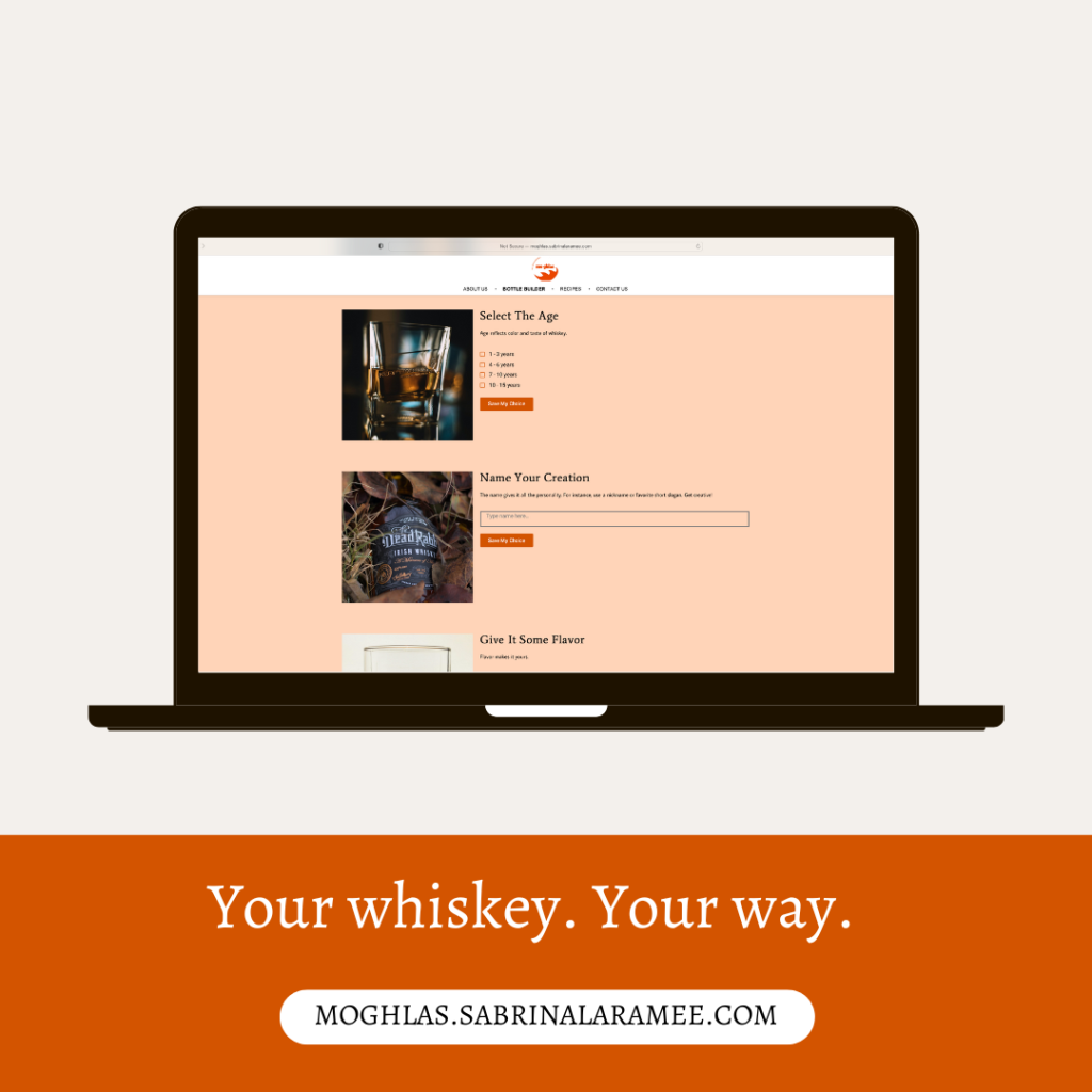
Mo Ghlas is a site that customizes whiskey. Mo Ghlas allows the customer to build their own bottle of whiskey online. It began as a project in my freshman year of college, and its purpose was to help prepare me for future web-based classes. I started the project in Adobe Illustrator, creating multiple layouts for each page. After using it for various projects during those web-based classes, I brought it to life with the help of WordPress.
The original objective of the project was to create a product that can be customized. With this objective in mind, I ran with the idea of customizing a product that nobody thought about customizing. Luckily, the idea blew my professor away and I was allowed to continue with the project.
This was the project that encouraged me to think way outside the box. Who would’ve thought to create a site that customizes whiskey? The final site has become something much better than I ever imagined when I started it. Cheers!